When writing reports and evaluating data, it is often necessary and useful to graph data. Charts and graphs have different uses and can be used to show changes over time, or to show relationships between two more things. We commonly use bar graphs, line plots, and pie charts to show these relationships visually.
In this article I will give an overview of a Zope Product on the Engineering servers that can be used to generate different kinds of graphs. I will also provide a simple example using an ECN supported example of a categorical line plot.
RenderableCharts is the name of the Zope Product used to configure and generate different kinds of charts and graphs. While the Product is very powerful, and very configurable, there is also almost no documentation that ships with it to make it easy to use. RenderableCharts provides an interface for users to use the graphing capabilities of the ReportLab toolkit, an add-on module for the Python programming language. It has the ability to create many different types of value and categorical line and bar graphs, as well as pie charts, scatter plots, The charts are highly configurable, allowing colors, fonts and font sizes, legends, and labels to be configured to each custom application. In addition, many of the configurable options can be determined at runtime during chart generation to meet any specific need.
From the Zope Management Interface (ZMI), create a ChartObject from the select to add dropdown. For my example I have created a ChartObject named "chartCategorical". Next, add a ChartTemplate, naming it "template" and select LineChart for the sample. Click the Add and Edit button to add the template. From here you can simply test the line chart by clicking on the Test tab.
As you click through the options within the template, you'll start to see how changing the values for the properties of the template changes the line chart. You can customize the colors, adjust the size, show a grid, and many other things.
You may be asking yourself, "How do I get my own data to appear in the graph?" That is where using RenderableCharts becomes difficult, and also the reason why I've been writing tools to make using RenderableCharts easier.
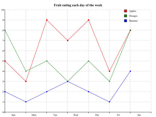
In this example we will graph the number of people who ate three kinds of fruit during a single week. The fruits will be Apples, Oranges, and Bananas, and the days of the week will be Sunday through Saturday.
Create a new folder, for this example with the id MyChart. In that folder, create a PersistentList object with id CategoryNames. In CategoryNames you will list out the different fruits that we have data for:
Apples
Oranges
Bananas
Next, create a Python Script with id initChart. This script will be called by ECN's example code to setup the data and categories we are graphing. For the contents of the script, put:
rows = []

# Days of the week
daysoftheweek = ['Sun', 'Mon', 'Tue', 'Wed', 'Thu', 'Fri', 'Sat']

# Number of each fruit eating, for each day of the week
apples = [5.0, 3.0, 9.0, 7.0, 9.0, 4.0, 8.0]
oranges = [8.0, 4.0, 5.0, 3.0, 5.0, 3.0, 8.0]
bananas = [2.0, 1.0, 2.0, 3.0, 2.0, 1.0, 4.0]

# Add each row to rows
rows.append(apples)
rows.append(oranges)
rows.append(bananas)

# Setup the chart
dict = {}

# Chart data
dict['Chart.data'] = rows

# The maximum for the Y-axis
dict['Chart.valueAxis.valueMax'] = 10

# The increment between tick marks on the Y-axis
dict['Chart.valueAxis.valueStep'] = 1

# Categories along the X-axis
dict['Chart.categoryAxis.categoryNames'] = daysoftheweek

# Chart title
dict['Title.text'] = 'Fruit eating each day of the week'

return dict
To view the graph, enter the full URL to the MyChart folder into the location bar of your web browser and append to it "/ECN/ZTools/Charts/chartCategorical". The URL will look a little cryptic, but it will utilize the example chart that has already been configured by ECN. You should see a graph that looks like the following:
You can use the same example with your own data. All you need to change is the code in initChart to process the data that you wanted charted. It will need to create a dataset like in the example above. Change the chart title and you are well on your way to creating your own charts and plots.
In future articles I will write about more advanced usage of RenderableCharts, as well as provide more examples of how to get more out of the tools ECN has created.
Links