A vessel trajectory is a sequence of data reports encoded with the spatial, temporal and other attributes. Usually, there are some rules to guide subjects, such as cars and vessels, to move. Therefore, there should be some common patterns among those subjects. For example, in the morning, cars generally move from the home to the working place, and reverse the path in the evening. But abnormal movement could be triggered by latent unknown factors, such as trafficking, storms and so on. Those abnormal information are usually overwhelmed by the normal movement patterns. Discovering and understanding the anomalous trajectories will benefit organizations, such as law enforcement agencies and companies, to locate their deficiencies and improve their resource allocation.
The anomaly this project aims to analyze is the vessel trajectory path deviation. For examples, in a collection of vessel movement paths, some vessels may move a different path instead of the common one.
Works of interactive vessel trajectory anomaly analysis usually represent the anomaly through the summary of anomalies, for example, the heatmap to highlight locations having higher anomaly frequencies. However, for the path deviation, the summary to show locations is insufficient because the path deviation is a dynamic process, starting from a smaller deviation from the common path and gradually increasing the deviation. These details cannot be shown in the summary based visual representations. Visualizations, like 2D lines and 3D lines, could show the deviation of paths. But lines are subject to the scale of trajectory size. The limited screen could become messy if there were too many lines.
Our project aims to propose an interface to interactively analyze the anomalous vessel paths. In this project, an interface is designed to load the anomaly detection results by machine learning algorithms, and provide scalable visualizations and flexible interactions to explore the anomalies. We wish our project could show the movement trend summarization of vessel trajectories, represent the geometric details of anomalous lines and allow users to locate singular trajectories whose paths deviate from the normal vessel trajectories.
RELATED WORKS
Users need be persuaded to trust the anomalies detected by machine learning algorithm. There are kinds of machine learning algorithms to detect the anomalies in the dataset. Multivariate covariance measurements are used by Filzmoser et al. to develop an unsupervised algorithm to detect outliers in the multivariate dataset. Gaussian mixture is by Laxhammar et al. to identify vessel paths that are different from a majority of vessel trajectories. Detection results by various algorithms could be different from each others. Even in the same detection algorithm, parameter setting modification could bring in a different outlier summary.
Visual representation of the anomalies is essential for users to understand outliers founded by algorithms. Current trajectory anomalous analysis algorithms generally provide an overall numerical distribution to explain why algorithms regard specific trajectories as anomalies. Instead, visualization could provide an intuitive expression for users to understand why algorithms regard these trajectories as anomalies.
For aggregation based visual representation, Heatmap and particles summarize the trajectory aggregation. Techniques proposed by Scheepens et al. and Scheepens et al. use heatmap to show the overall trend of trajectories, and code the anomalies as extra glyphs on the heatmap. Then, users could know the locations where a majority of anomalous trajectories pass by. And this kind of visualization isn't restricted by the data scale. But users could lose the geometric information of anoamlous information becuase users could not find the geometric information of anomalous trajectories.
Lines, such as 2D lines and 3D Space-time cubes, are the common methods to visualize the movement trend of trajectories. Colors in these visual representations encode the anomalies. Aware of the specified colors, anomalies could be noticed by users. And the geometric path could be preserved in this kind of visualization. However, for the path related anomalies, these trajectory visualization methods are not enough considering the scale of the number of trajectories and the geometries of paths. The scalability of trajectories hinders the visual representation of anomalous information in the line format, since 2D line drawing or 3D space-time cubes are subject to the number of trajectories. The visual representation will be dense and messy if there were a lot of trajectories in the limited pixel screen.
In this project, we try to explore the interactive visualization through three visual representations, not only an aggregation view of trajectories which is free from data scalability but also two line based views that are maximally show the shape information of trajectory lines to users.
VISUAL REPRESENTATION
We seek three kinds of visual representations to show trajectory information.
Summarization of vessel movement paths
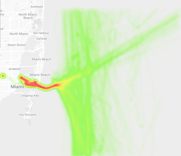
Vessel movement follow the nautical chart. Through the summarization of trajectory paths, we can conclude the busy sealines and less bussier sealines. Heatmap is adopted to visualize the spatial distribution of paths.
Figure 1. Heatmap represents the spatial distribution of vessel paths. From this figure, we can find that most vessels moving near the Miami aport go to the inside of the Miami port, and a smaller ratio of vessels just go by the port.
Color encoded vessel movement paths
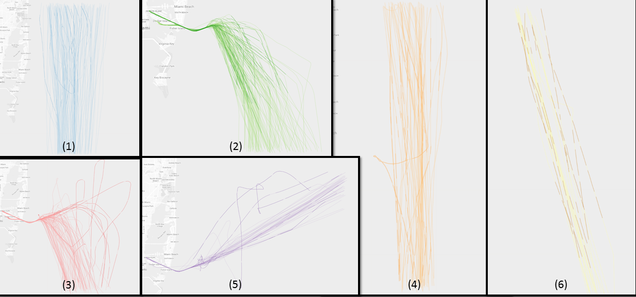
This project aims to help users identify abnormal trajectories whose paths are different from normal paths. Paths deviating from the normal paths could be detected by the machine learning algorithm. But it is not easy to present both the normal parts and the abnormal parts of paths on the map because the paths are messy and overlapped. Therefore, we use different color hues to encode the normal patterns and abnormal patterns. In order to highlight the abnormal patterns that are fewer numbers of trajectories compared with normal patterns, the anomalies are colored with darker colors. Figure 2 shows the color that we applied in our system, these colors are adopted from the qualitative category of colorbrewer website. Trajectories are classified based on their sources and destinations as shown in Figure 3.
An interactive polyline drawing tool (as shown in Figure 4) was designed to facilitate the process of picking a single line. The overlap of large number of trajectories in a limited area caused the problem of visual clutter. The traditional method of selecting an object is using mouse hover and then the corresponding one under the mouse position is highlighted. We intended to develop a simple and continent tool to support the single line selection. The ideas is straightforward, users can sequentially draw points on the map and these points formed a polyline. We calculate the closest distances from every drawn points to all trajectories and then rank the trajectories based on the minimum distance. In the current version, only the distance from drawn points to trajectories are consider not including the order of points. We need refine the minimum distance calculation method in the future to improve the accuracy of selection. After getting the rank list of all trajectories, users can go through the rank list to compare different trajectories.
Figure 2. Every cluster is assigned two unique colors. The light color encode the normal part of a trajectory, and the darker color encodes the abnormal part of a trajectory.
Figure 3. (1)-(6) represents 6 clusters of trajectory. In every cluster, normal parts of trajectories are encoded in the ligher color, and the abnormal parts of trajectories are encoded in darker color.
Figure 4. A polyline was drawn through markers. A rank list of trajectories was obtained using the minimum distance from these markers. The trajectory with ID “28830” was selected.
Depth-encoded vessel movement representation
In addition to use colors to encode anomalous segments of the path, we also try to apply 3D graphics to represent anomalous information. We expect the anomalous part of the trajectory lay on top of normal parts of other trajectories, so that users could notice the anomalous part at the first glance. Halos are applied to construct the 3D effects of lines. The depth-encoded 3D line view could help anomalous trajectories stand out of normal trajectories, so that users could observe anomalous trajectories among a huge number of trajectories.
Every trajectory is composed of a series of line segments. A depth value is assigned to every line segment based on whether it is anomalous. If the line segment is normal, following the common paths, its depth is assigned a baseline value. As seen in Figure 5, if the line segment is abnormal, deviating from the common paths, its depth is assigned a different value to make sure itself on top of the normal line segments.
Users could zoom in/out this view to watch the overlay details of trajectories.
Figure 5. 3D graphs are applied to show the anomaly enhanced visual representaion of vessel paths. Depth of every line segment in the path encodes the anomaly value. (1)-(6) show the result per cluster perspectively.
SYSTEM IMPLEMENTATION
Our system is implemented using HTML5 and JavaScript. The depth-encoded vessel movement representation is rendered using WebGL with the library three.js. For the client side, the tool uses the Google Maps JavaScript API v31 to render a world map.
The dataset is a public dataset in the marine agency. It records vessel movement around the Miami port, dealing with more than 1000 vessels and spanning from January 1st, 2009 to January 31st, 2009. Vessel trajectories are classified into 6 clusters based on the trajectory movement source and destinations with the algorithm by Lee et al. Anomalies are detected based on the spatial deviation distance of trajectories using the algorithm by Filzmoser et al.
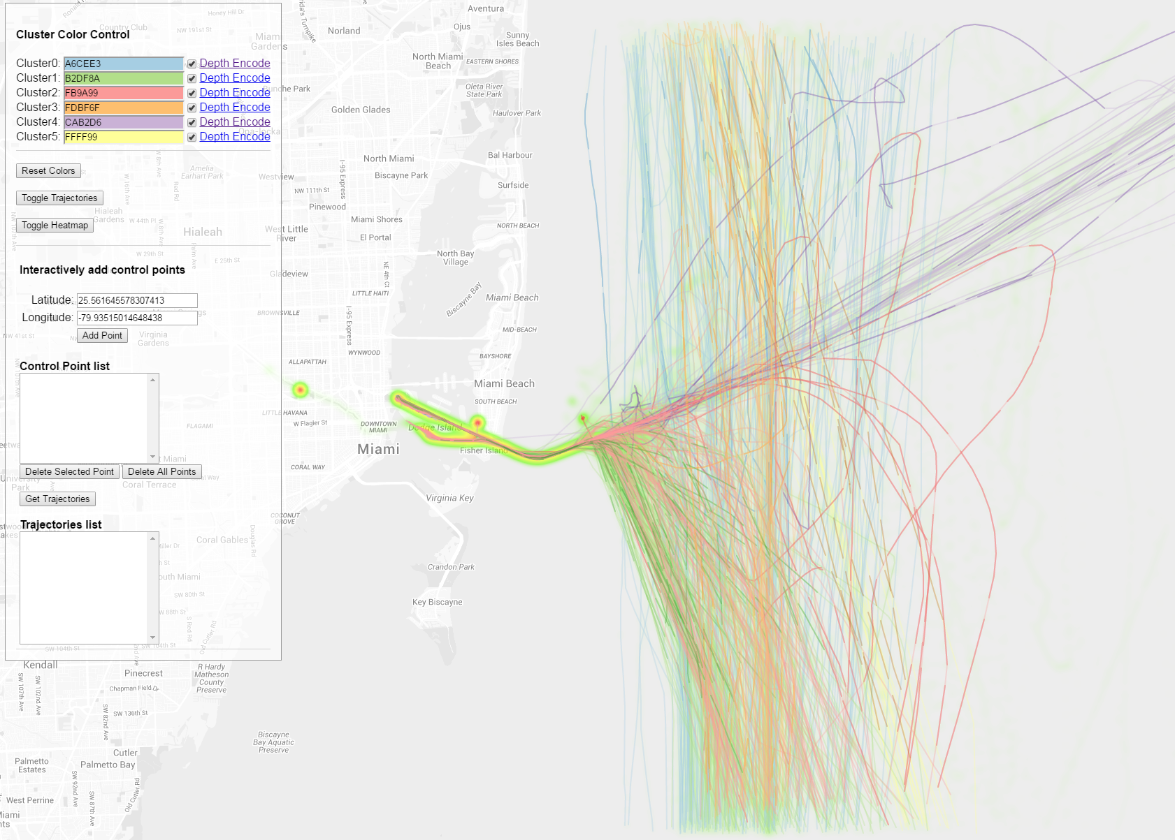
The interface of our system is pretty straightforward. Figure 6 shows the overview of our visual analytics system. For the control panel on the up left corner, users can change the color of each cluster using a color selection tool (shown in Figure 7). Uses can select a specific cluster by using the checkboxes on the right side of a cluster. Buttons for displaying trajectories and heatmap are explicitly placed under the color bars.
Figure 6.Overview of a trajectory exploration tool. On the up left corner, a control panel shows the color setting for each clusters an on-off button for showing trajectories, heatmap or not.
Figure 7. A color selection widget.
Users could click the checkbox and toggle to show or hide a specific view.
EVALUATION
In order to empirically evaluate our web based visualization tool to support interactive discovery of abnormal patterns for trajectory data, we will conduct an on-site pilot user study and recruit five volunteer students to test the usability of our tool. We will use AIS Vessel dataset in our experiment. Before the study, participants will attend a training session to learn the background information of the underlying dataset, functionality of our interface. After that, we split the 5 students into 2 groups to test. Test tasks are summarized in Table 1.
For Group 1, in order to evaluation their efficiency, we will record the time and interaction sequence they spend on this task. To test the error rate of our selection tool, we will count how many times participants take to select the trajectory they want. For Group 2, because the trajectory selection in the 3D view has bugs that make the trajectory selection sometimes crashes, we gave up the time measurement and the count of mouse clicks.
At the end of the study participants were asked to fill a feedback survey of our application. Because most of the task questions are open ended, we evaluated the quality of answers provided by participants. We investigated the expected answers vs. unexpected ones to understand the usability of our tool. We will adopt the suggestions relate to user interface to improve overall quality of our system in our future work.
Table 1. The user study
Group ID
No. of participants
Task description
1
2
Participants use the color-encoded view (seen in Figure 3) to find 3 trajectories that have the longest anomalous segments in the cluster 3, 4, and 5 and write down the id number. Interactions provided to users are map pan, map zoom in/out, and mouse click.
2
3
Participants use the depth-encoded view (seen in Figure 5) to find trajectories that have the longest anomalous segments in the cluster 3, 4, and 5, and write down the id numbers. Interactions provided to users are only map zoom in/out
Two participants in Group 1 take almost 3 minutes to complete the task per cluster. The two pieces of the answer sheets have almost the same result in the cluster 3 and cluster 5. But the result in cluster 4 is quite different from each other. We attribute to the result due to the dense of trajectory aggregation. In the cluster 3 and cluster 5, there are several paths that quite deviate from the common paths. Therefore, participants are easy to find the longest anomalous trajectories in these two clusters. However, in the cluster 4, trajectories not only posses similar shapes to each other, but also densely aggregated. Participants take longer time to use mouse to select anomalous trajectories. In their self-reported feedback, they think the mouse click interaction in 2D color encoded visualization is a little cumbersome because they first need to do mouse click to add a point, and then to click the "add point" button to confirm the point. Both of them think the interaction could be simplified.
Three participants in Group 2 provide quite similar answers. They have exactly the same answers for Cluster 5, almost the same answers for Cluster 3 and have one different answer for Cluster 3. Compared to the answers in Group 1, participants provide quite similar answers, which means that depth-based visual representations make the most anomalous trajectories stand out. Through observing these participants, we found that it is hard to select trajectories, especially in the coarse zoom level. We think that in the coarse zoom level, there is a bigger deviation between the location users want to click and the location the computer captured position of users click.
Through comparison of the experiment results of Group 1 and Group 2, we think that color-based 2D lines are easy to do interactions, but hard to differentiate anomalous and normal trajectories in the dense area. As to the depth encoded 3D lines, they are easy to tell from each other since users could zoom in enough to tell details, but hard to do flexible selection.
CONCLUSION
In this project, we explore how to explore the anomalous trajectories. Through providing the aggregation view, heatmap, the color-encoded 2D line view, and the depth-encoded 3D lien view, we allow users to explore anomalous trajectories in different granularity. Heatmap is free from the trajectory scalability, but lose the shape information of trajectories. Line expression could keep the shape information but subject to the scalability issue.
We use color and depth to differentiate trajectories from each other. Color-based 2D lines are easy to interact with, but subject to the dense issue. Depth-based 3D lines could use depths information to differentiate trajectories in the dense area, but its interaction is hard to manipulate. We also find that the aggregation of trajectories and similarity of trajectory shapes could increase the difficulty to find anomalous trajectories, because users have trouble to observe patterns in dense areas.
For the interaction, we noticed that the mouse clicks in 2D view take too much time to select a trajectory, but mouse hover in 3D view is hard to locate single trajectory especially in the dense area. Depth encoded representation only recommends few prominent abnormal trajectories, the interaction in the three dimensional space is harder than two-dimensional space. It takes time to location one line.
BIBLIOGRAPHY
[1] Hauser, Helwig, Florian Ledermann, and Helmut Doleisch. Angular brushing of extended parallel coordinates. In Information Visualization, 2002. INFOVIS 2002. IEEE Symposium on, pp. 127-130. IEEE, 2002.
[2] Scheepens, Roeland, Niels Willems, Huub Van de Wetering, Gennady Andrienko, Natalia Andrienko, and Jarke J. Van Wijk. "Composite density maps for multivariate trajectories." Visualization and Computer Graphics, IEEE Transactions on 17, no. 12 (2011): 2518-2527.
Harvard
[3] Scheepens, Roeland, Niels Willems, Huub van de Wetering, and Jarke J. Van Wijk. "Interactive visualization of multivariate trajectory data with density maps." In Visualization Symposium (PacificVis), 2011 IEEE Pacific, pp. 147-154. IEEE, 2011.
[4] Scheepens, Roeland, Christophe Hurter, Huub Van De Wetering, and Jarke J. Van Wijk. "Visualization, selection, and analysis of traffic flows." Visualization and Computer Graphics, IEEE Transactions on 22, no. 1 (2016): 379-388.
[5] http://marinecadastre.gov/ais/
[6] M. H. Everts, H. Bekker, J. B. Roerdink, and T. Isenberg. Depth-dependent halos: Illustrative rendering of dense line data. Visualization and Computer Graphics, IEEE Transactions on, 15(6):1299-1306, 2009.
[7] N.Willems, H.VanDeWetering, and J.J.VanWijk. Visualization of vessel movements. In Computer Graphics Forum, volume 28, pages 959-966. Wiley Online Library, 2009.
[8] Jae-Gil Lee, Jiawei Han, and Kyu-Young Whang. 2007. Trajectory clustering: a partition-and-group framework. In Proceedings of the 2007 ACM SIGMOD international conference on Management of data (SIGMOD '07). ACM, New York, NY, USA, 593-604.
[9] P.Baudisch and R.Rosenholtz. Halo: a technique for visualizing off- screen objects. In Proceedings of the SIGCHI conference on Human factors in computing systems, pages 481-488. ACM, 2003.
[10] D. Holten. Hierarchical edge bundles: Visualization of adjacency relations in hierarchical data. Visualization and Computer Graphics, IEEE Transactions on, 12(5):741-748, 2006.
[11] Peter Filzmoser, Robert G. Garrett, and Clemens Reimann. 2005. Multivariate outlier detection in exploration geochemistry. Comput. Geosci. 31, 5 (June 2005), 579-587.
[12] R. Laxhammar, G. Falkman, and E. Sviestins. Anomaly detection in sea traffic-A comparison of the gaussian mixture model and the kernel density estimator. In Information Fusion, 2009. FUSION'09. 12th International Conference on, pages 756-763. IEEE, 2009.
[13] https://developers.google.com/maps/
[14] http://threejs.org/
[15] Jian Zhao, Fanny Chevalier, and Ravin Balakrishnan. 2011. KronoMiner: using multi-foci navigation for the visual exploration of time-series data. In Proceedings of the SIGCHI Conference on Human Factors in Computing Systems (CHI '11). ACM, New York, NY, USA, 1737-1746.