Team Name: PurdueMappers
Team Members: Abdullah Alshaibani and Thamir Qadah
Many geotagged streaming data sources are available publicly nowadays. Examples include live microblog feeds [Twitter], live photo content feeds [Instagram], location-based transit data feeds [TransitFeeds] and weather alert feeds [NWS]. Unfortunately, getting started with analyzing such streaming data involves a significant degree of efforts and technical skills.
Consider an emergency response coordinator with very little programming experience. Suppose that he is tasked with analyzing the 911 calls to find interesting patterns in the stream of 911 calls. This can be done by visualizing where the 911 calls are originating from and analyze where help is needed the most. This can be done by manipulating the data stream and visualizing it using various techniques to gain insights and better understanding of the data streams.
To perform this task, our emergency response coordinator needs to learn the following:
Another motivating example would be the case of a marketing analyst with very little programming experience. Suppose that she is tasked with analyzing tweets to understand if the recently deployed marketing campaign is taking effect. One analysis she needs to perform, given the live twitter feed, is visualizing the number of tweets that are mentioning her product distributed over the geographic boundaries of the states. This can be done by overlaying a histogram over each state. Each histogram represents the number of tweets in its respective state. After this, she wants to further divide the numbers into two categories representing the demographics of the people who tweeted.
In this project we address the challenge of making such tasks easier to perform and less overwhelming.
Figure 1, shows an example of a custom made interactive map-based visualization using some existing tool. However, this tool does not support analyzing live public feeds (e.g. twitter live stream).
Figure 1 - Credit: http://www.mapbusinessonline.com/Solution.aspx/Interactive-Map
Recently, there has been some interest in developing map-centric programming environment [Are15, Tah15]. However, these systems do not address usability aspect of the programming environment. In addition, recent work on supporting exploratory data analysis with live programming showed potential for a live programming approach [Del15] but they do not explore map-based data analytics.
We address the research question of how a novice user can perform simple exploratory data analysis over live geotagged data streams. One viable approach is to use the concept of live programming [Mcd13,BVicWeb].
Live programming is the process of writing computer programs while having continuous perceptual feedback of the program’s execution. Feedback can be visual, auditory or both. For example, for GUI-based applications, live programming gives the programer direct feedback of result of the program. Even for non-GUI-based programs, live programming is used to program music pieces [Sor05].
Furthermore, since the data in the question is geotagged, a good presentation is an interactive cartographic map. As a result, we propose a multiparadigm map-centered live programming environment to help novice users in their exploratory data analysis tasks.
The system will support exploratory data analysis by live programming over live geo-tagged streams. One important challenge is ensuring acceptable response time. To address this challenge we propose to use a client side only approach instead of the client-server approach like in [Tah15]. In this approach, the client would do all the processing instead of the server. However, the users will still experience slow response time if data needs to be loaded from the server.
Another challenge is easiness of use. The main idea behind building a user interface for such a web application is having the interface be functional, as well as, self-explanatory such that users would not have issues getting started, and creating a simple map with minimal effort. We will utilize the concept of auto-completion for helping users in their coding efforts and minimize the cognitive overhead required for remembering the language syntax. Furthermore, we will define domain specific high-level operations and functions that will be built into the programming environment.
Figure 2: System Architecture
Figure 2 shows the system’s architecture. Due to security models used in Javascript (i.e. Same-origin policy), it is not possible to access external websites. Therefore, we have to use our own HTTP server to act as proxy for obtaining the data. A server-side process will connect the data stream source (e.g. Twitter’s Streaming API) and forward the stream to the client. For each data stream source, an adapter implementation is needed as each data source API can be different. This is also an advantage of this system design as details on connecting to the data stream source are abstracted away from the end-user.
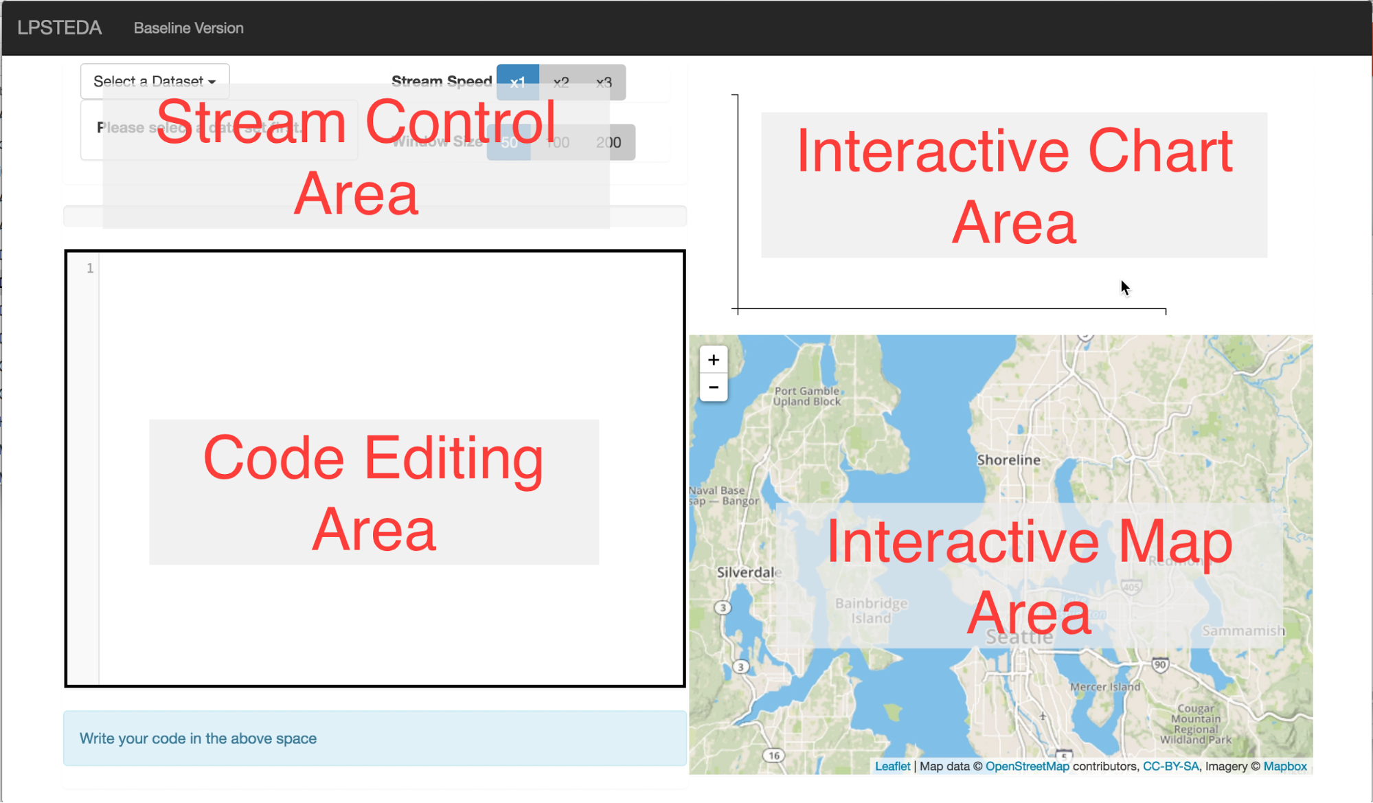
At the client side, we will utilize existing open-source javascript libraries for visualization and exploratory spatial data analysis. In a live programming environment (Figure 3), the code editor (Input), the program execution state, the chart representing the data, and the Map-based interactive visualization (Output) must be continuously synced to provide the live programming environment. Additionally, we provide sample files to simulate streams at the client side. The stream digestion at the client side can be controlled using a widget. The widget allows users to simulate stream arrival speed, stream window size and start/stop the stream.
Figure 3: The top left has the stream control used for simulating data streams, the top right has the chart to compare the data, the bottom left is the code editor where the user writes the conditions, and the bottom left is the map-based view of the data stream. This is a the live programming version.
In this project, we support two types of operations on data streams; spatial filtering and textual categorizing.
Spatial Filtering will allow users to hide unwanted data stream tuples from contributing to the visualizations based on a spatial attribute. For instance, in the 911 calls data set, an analyst may want to see only calls within a certain neighborhood only.
Textual Categorizing will allow users to split the data into “bins” and compare their statistics. For instance, users can compare the frequency of two different trending hashtags from a live twitter streams
We support two types of visualizations. The first one is a bar-chart which will allow users to compare statistical properties of the data. The second type is a map based visualization which will allow users to interactively explore the spatial aspect of the data streams. Both types of visualizations are needed because of the nature of the data streams. We are focusing on data streams that include three types of attributes; namely, temporal, textual and spatial attributes.
To make the lives of the users easier, our project includes a stream control widget that allows the user to simply choose the source of the stream and start the stream. Because a data stream is considered “infinite” and unbounded, it is desirable to specify a finite window, which will aid in operating over streaming data. The window size can be specified using different attributes such as the number of data tuples (e.g. last 100 tuples) in the window or the temporal attribute of the data tuples in the window (e.g. last 5 minutes). In our current implementation, we only support the count-based window size. For simulated data streams, the default window size is 50 tuples, but they can be increased up to 200 tuples in the window. The user also has the ability to increase the rate of arrival of new data. For simulated data streams, the default settings is one tuple per second, but the rate can be increased by multiples of 2. (e.g. two tuples per seconds and four tuples per second)
We have implemented support for integration with Twitter’s live streaming API. This allows our users to analyze live tweets streamed directly from Twitter’s streaming API.
We used many open source projects in our implementation. For client side, we used [CodeMirror] to implement the code editor, [Bootstrap] for UI layout, [LeafletJS] for the interactive map widget, and [Vega] for the bar chart visualization. For the server side, we implemented the web server using [Scala] and the [Spary.io] framework. Additionally we used a free web service [Mapbox] for providing the tiles of the map component.
Our code is available on github at the following link: https://github.com/qadahtm/lpsteda
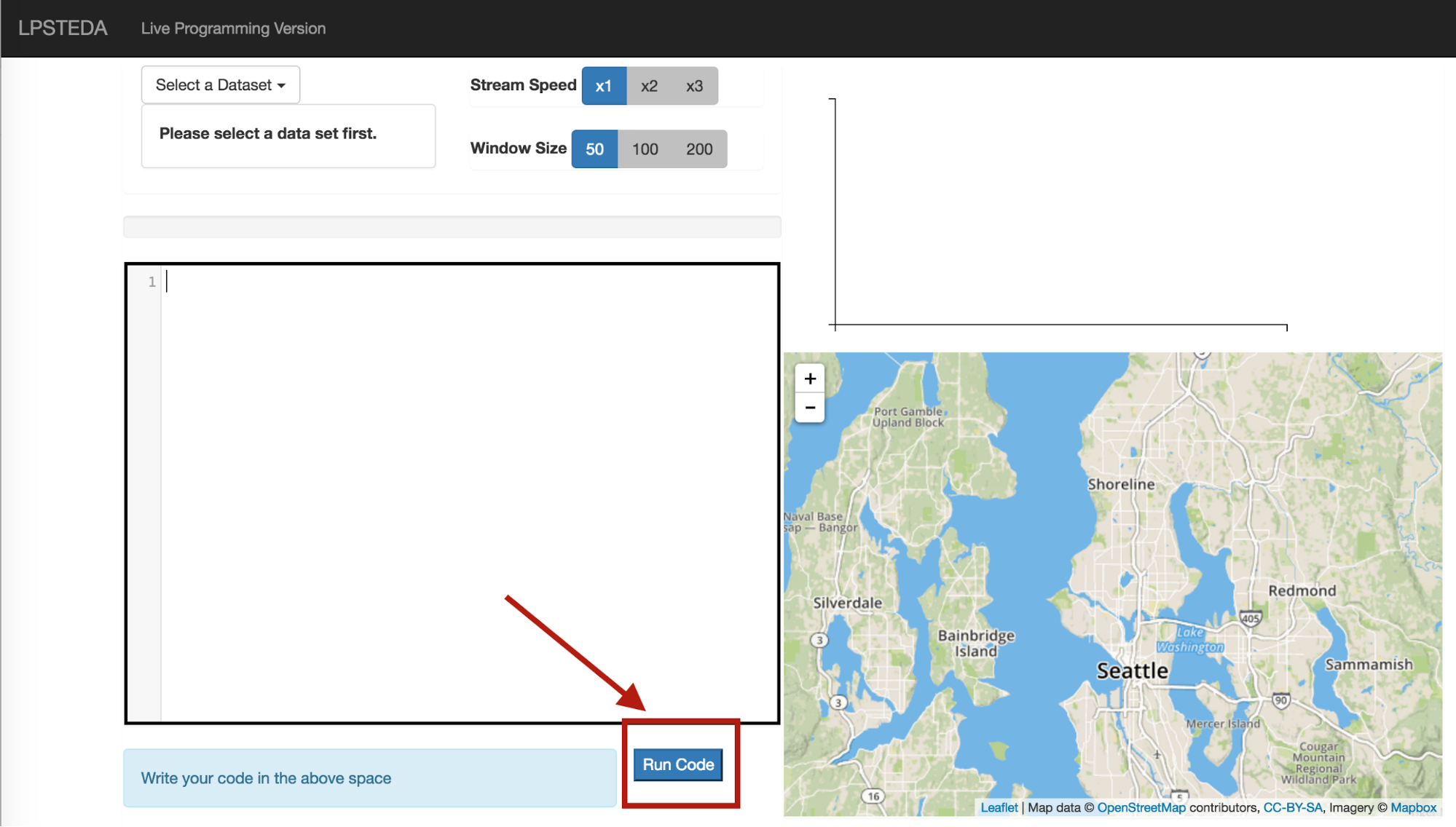
We performed a usability study on our platform and a baseline. The baseline was our platform but without the live programming aspect. The baseline will have a button to run the code (see Figure 4).
Figure 4: Baseline interface with a button to run the code explicitly by users.
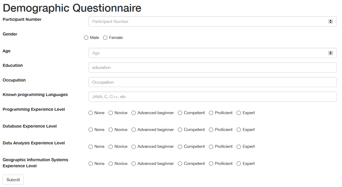
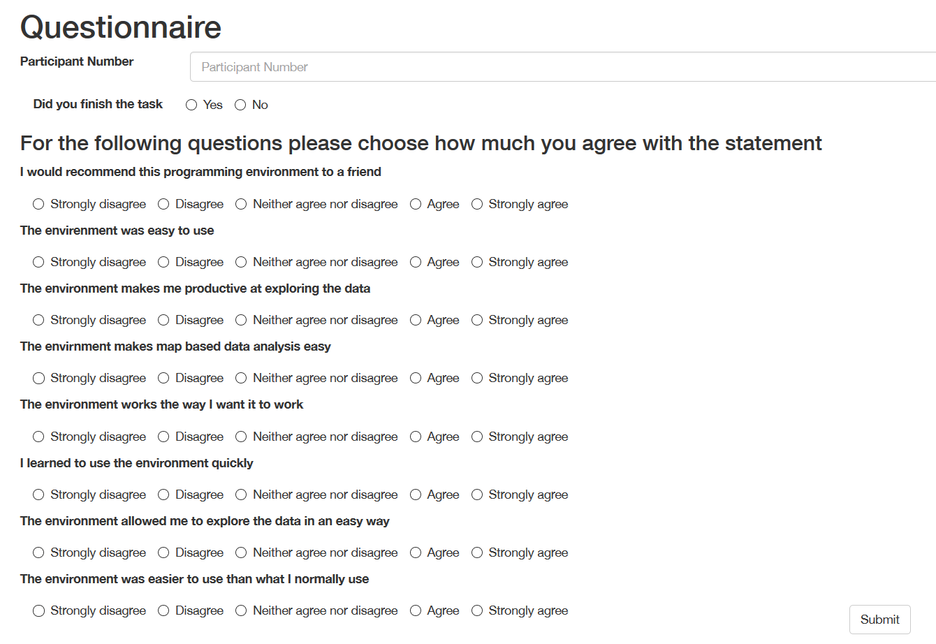
To measure the user’s satisfaction using our platform we asked each user to perform three tasks on the live environment and three tasks on the baseline environment. To remove bias we switched the order of which environment the user used first as well as the task set for each platform. The users were asked three different questionnaires, the first being a demographic questionnaire (Figure 5), the second a questionnaire about the user’s experience on the first platform (Figure 6), and the last a questionnaire to compare the two platforms (Figure 7). We used the 5-point Likeart scale [Lik32] in the questionnaires.
Figure 5: The questionnaire used to understand the users and their experience level.
Figure 6: The second questionnaire used to evaluate the first response to either the baseline or the live environment.
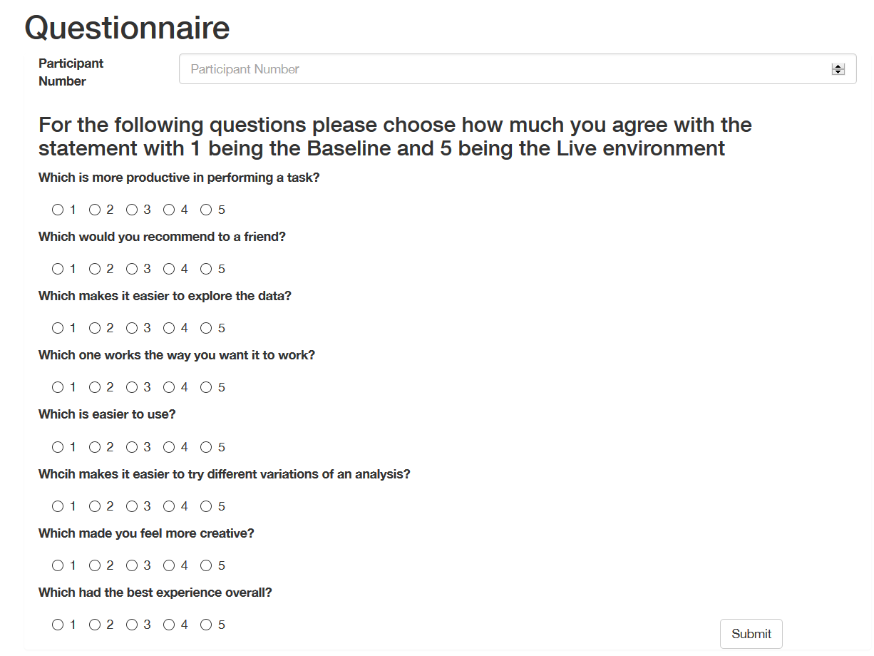
Figure 7: The questionnaire used to compare the two environments with each other.
Due to the time constraints on this project, we only evaluated the live-programming aspect of the platform. As a baseline, we implemented a typical coding environment, where programmers will need to “compile and run” their code before it can take an effect. This process can be described as the edit-compile-run cycle.
Another baseline that can be used is the typical web development cycle, which can be described as edit-save-refresh cycle. Editing will be performed using typical editors such as SublimeText. Users will have to keep open multiple programs such as the editor and the browser. However, this baseline will require high levels of web programming skills, and it is straightforward to see that our platform eliminates this requirement.
To evaluate the platform the users will be asked to perform the following sets of tasks:
Set 1:
Set 2:
The user study will address the evaluation of the following hypotheses:
H1. Subjects will find our platform easier to work with compared to the baseline.
H2. Subjects will find our platform more efficient to use and work with compared to the baseline.
H3. Subjects will find our platform less overwhelming for programming interactive maps.
After conducting the user study, we found that the users prefered the live environment over the baseline (Figure 8). Most users had the problem of not exploring the data when using the baseline, which defeats the purpose of our platform. They wrote the full command to perform the task and moved on, while the users that used the live environment, actually spent more time looking through the data. In (figure 9 and 10) the users rated the platforms as their main compilers not as a platform to perform a specific map based visualization task.
Figure 8: The user’s reaction to the live programming aspect of the interface
Figure 9: The results of the first questionnaire for the users that first used the live platform
Figure 10: the results of the first questionnaire for the users that first used the baseline platform
The recruiting was done by talking to people in labs on campus and asking them to be part of our user study. Each user took 20 to 30 minutes to test our system.
We plan to explore several aspects of live programming features and learnable programming design [BVicWeb]. Concepts from [BVicWeb] will be used such as making meaning transparent, and explaining in context. Another feature we want to support, is the use of spatial attributes for the visualizations. This feature is useful when users want to filter/categorize data based on their spatial attributes. For instance, a user may want to overlay a chart over a specific spatial region (e.g. a state), which will describe the statistical properties of the data within that region. For data streaming support, we want to support different types of data streams and allow users to use their own data streams.
In the end of our study we found that having a live environment made the process of exploring data much easier and allowed the users to actually explore the data, instead of simply performing the task required. That was one of the main reasons why completion time was not used in the study, almost all the users went out during their tasks and explored the possibilities and patterns in the data, which made some tasks longer than others. The users did exactly what the tool was designed for, map data analysis and exploration. We found that such a tool helps and simplifies the exploration process, as a GIS user mentioned, “What usually takes me a long time to perform, I was able to do in seconds”.
[Are15] W. G. Aref, S. Prabhakar, J. Shin, R. Y. Tahboub, A. Abdelsalam, and J. W. Aref, "On map-centric programming environments: Vision paper," GIS '15. New York, NY, USA: ACM, 2015. http://dx.doi.org/10.1145/2820783.2820886
[Bootstrap] http://getbootstrap.com/
[BVicWeb] Learnable programming.http://worrydream.com/LearnableProgramming/
[CodeMirror] https://codemirror.net/
[Del15] R. DeLine and D. Fisher, "Supporting exploratory data analysis with live programming," in Visual Languages and Human-Centric Computing (VL/HCC), 2015 IEEE Symposium on. IEEE, Oct. 2015, pp. 111-119. http://dx.doi.org/10.1109/vlhcc.2015.7357205
[Instagram] Instagram developer documentation. https://www.instagram.com/developer/
[LeafletJS] http://leafletjs.com/
[Lik32] Likert, Rensis. "A technique for the measurement of attitudes." Archives of psychology (1932).
[Mapbox] https://www.mapbox.com/
[Mcd13] S. McDirmid, "Usable live programming," Onward! 2013. New York, NY, USA: ACM, 2013, pp. 53-62. http://dx.doi.org/10.1145/2509578.2509585
[NWS] NWS public alerts in XML/CAP v1.1 and ATOM formats - NOAA's national weather service. http://alerts.weather.gov/
[Scala] http://www.scala-lang.org/
[Sor05] A. Sorensen, "Impromptu: An interactive programming environment for composition and performance," in Proceedings of the Australasian Computer Music Conference 2009, 2005. http://eprints.qut.edu.au/31056/
[Spary.io] http://spray.io/
[Tah15] R. Y. Tahboub, J. Shin, A. Abdelsalam, J. W. Aref, W. G. Aref, and S. Prabhakar, "LIMO: Learning programming using interactive map activities," GIS '15. New York, NY, USA: ACM, 2015. http://dx.doi.org/10.1145/2820783.2820796
[TransitFeeds] TransitFeeds - public transit feeds from around the world. http://transitfeeds.com/
[Twitter] The streaming APIs - twitter developers. https://dev.twitter.com/streaming/overview
[Vega] http://vega.github.io/vega/