Plotting Data in MATLAB
Plot Commands
| Command & Syntax | Purpose |
|---|---|
| plot(x,y,'LineSpec') | Creates a two-dimensional plot using vectors x and y. The default is a line plot; use the line specification to change it to markers when plotting raw data. Also, use the styles to indicate the type and color of the data marker or line. |
| subplot(m, n, p) | Creates axes in tiled positions in an mxn grid. Activates the pth axis so that the next plot created displays on the pth axis. |
| figure(n) | Creates a new figure object. |
| hold on hold off |
“holds” an existing plot so a new plot can be added to it. If hold is “off”, then a second plot command will replace the earlier plot. |
Plot Formatting
All plots in this class require professional formatting. Every plot needs a concise and descriptive title, x- and y-axis labels with units, and a grid for easier plot interpretation. If the figure contains the plots of more than one data set, it also requires uniquely identifiable markers for each data set, a formatted legend that does not cover the data, and a common axis scale range. You can learn more about these requirements in the course learning objectives.
| Command & Syntax | Purpose |
|---|---|
| title('concise and descriptive title') | Titles the plot area with the specified string |
| xlabel('label [units]') ylabel('label [units]') |
Labels the x or y axis with the specified string |
| legend('data_description1','data_description2',...) | Adds a legend to a plot. The descriptors in the legend must be in the same order as they were plotted. |
| grid on | Adds grid lines to the current axes |
| axis([xmin xmax ymin ymax]) | Sets the limits for the x and y axes of the current axes |
Plot Examples
These lines of code import accelerometer data for two separate tests and assign the data columns to individual vectors:
%% INITIALIZATION
accData1 = readmatrix('test1_data.txt'); % accelerometer data from test 1
G1 = accData1(:,1);                      % G-force acceleration (g)
volt1 = accData1(:,2);                   % accelerometer voltage (V)
accData2 = readmatrix('test2_data.txt'); % accelerometer data from test 2
G2 = accData2(:,1);                      % G-force acceleration (g)
volt2 = accData2(:,2);                   % accelerometer voltage (V)
If you want to try the plot examples yourself in MATLAB, you can download the data files here.
The following code and corresponding figures demonstrate various ways to plot this data.
Single Data Set
Default Plot Command – USE WITH CAUTION
% Plot voltage vs acceleration (default plot command)
% Notice that this plot does not make sense
figure(1)       % activate the figure window
plot(G1,volt1)  % plot the data
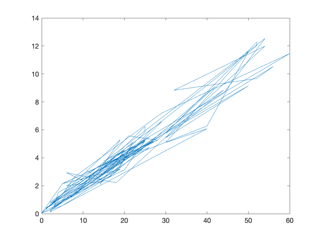
Plot Notes
This plot does not make sense. The original data should be displayed with markers, not lines. The lines are zigzag and do not tell a reader anything about the relationship between g-forces and voltage. The plot also is lacking all professional formatting.
Basic Scatter Plot
% Plot voltage vs acceleration as a scatter plot
% This is the proper way to display raw data
figure(2)            % activate the figure window
plot(G1,volt1,'ko')  % plot data as black circle markers with no line
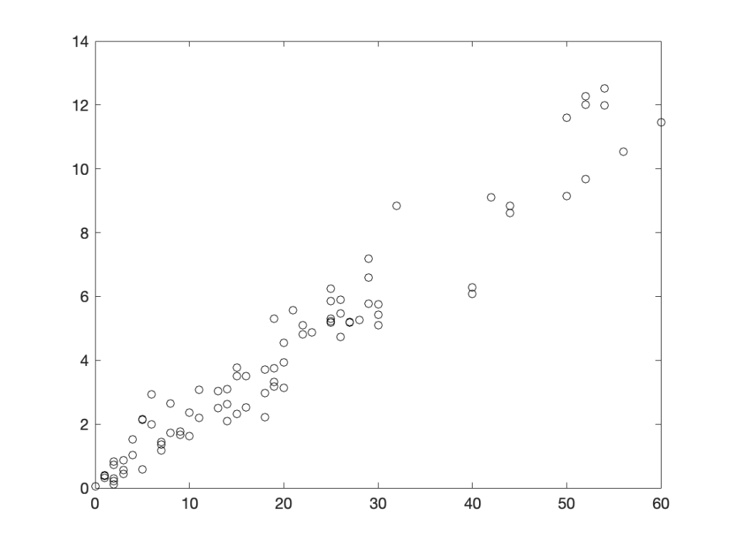
Plot Notes
This plot is readable and shows the relationship between g-forces and voltage. The original data are displayed with markers, as required in this course. The plot still lacks any other professional formatting.
Plot of Single Data Set with Professional Formatting
% Format the scatter plot for technical presentation
figure(3)
plot(G1,volt1,'ko')
title('Voltage vs Acceleration for Test 1') % set the title
xlabel('Acceleration (g)')                  % set the x label
ylabel('Voltage (V)')                       % set the y label
grid on                                     % turn on the gridlines
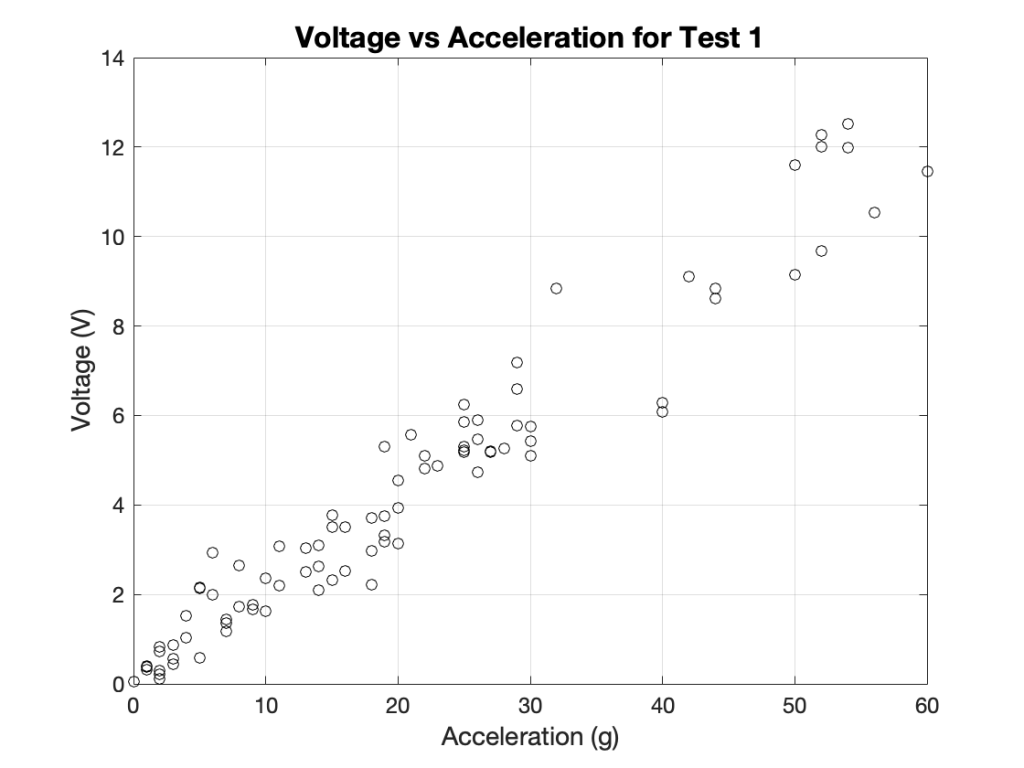
Plot Notes
This plot is readable and shows the relationship between g-forces and voltage and is formatted for professional presentation.
Multiple Data Sets on a Single Plot
Basic Scatter Plot on Same Axes
% Plot voltage vs acceleration for both tests (no formatting)
figure(4)
plot(G1,volt1,'ko') % plot test 1 data as black circle markers
hold on             % keep axes active to add a new plot
plot(G2,volt2,'bs') % plot test 2 data as blue squares
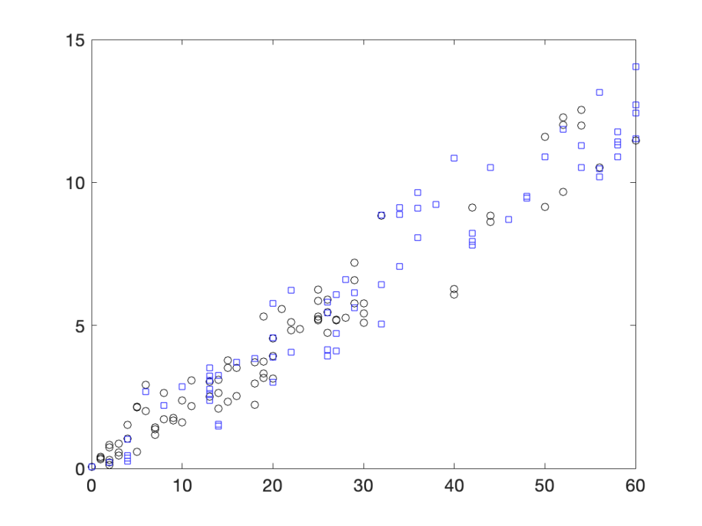
Plot Notes
This plot is readable and shows the relationship between g-forces and voltage for two separate data sets. Notice that the two data sets are displayed with different marker shapes. This plot lacks professional formatting.
Formatted Plot of Two Data Sets on Same Axes
% Plot voltage vs acceleration for both tests on single axes
figure(5)
plot(G1,volt1,'ko') % plot test 1 data as black circle markers
hold on             % keep axes active to add a new plot
plot(G2,volt2,'bs') % plot test 2 data as blue squares
title('Voltage vs Acceleration for Two Tests')
xlabel('Acceleration (g)')
ylabel('Voltage (V)')
grid on
legend('Test 1','Test 2','Location','southeast')   % add the legend and avoids covering data
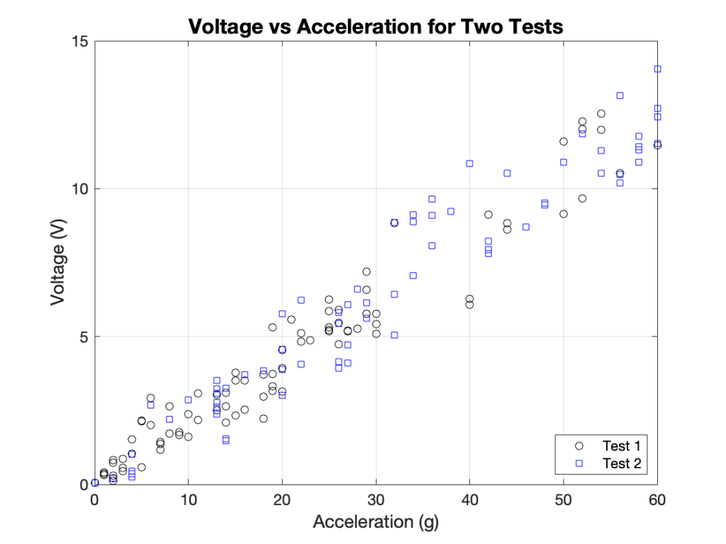
Plot Notes
This plot shows two data sets displayed clearly with markers and is formatted for professional presentation.
Multiple Plots in a Single Figure
Basic Multiple Scatter Plots in a Single Figure
% Plot the two data sets in separate plots within the same figure
figure(6)

subplot(2,1,1)      % activate top subplot in a 2x1 grid
plot(G1,volt1,'ko') % plot test 1 data as black circle markers

subplot(2,1,2)      % activate bottom subplot in a 2x1 grid
plot(G2,volt2,'bs') % plot test 2 data as blue squares
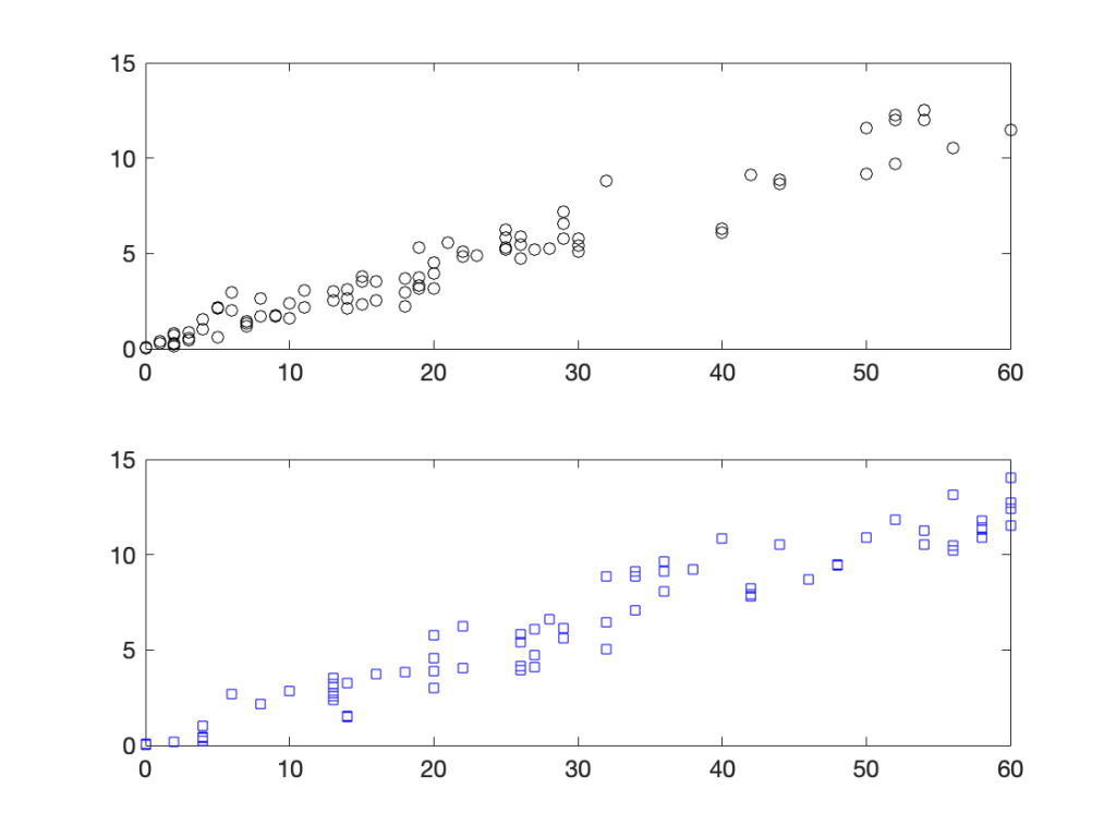
Plot Notes
This plot shows two separate plots within the same figure window. The plot lacks professional formatting.
Formatted Multiple Scatter Plots in a Single Figure
% Plot the two data sets in separate plots within the same figure
figure(6)

subplot(2,1,1)      % activate top subplot in a 2x1 grid
plot(G1,volt1,'ko') % plot test 1 data as black circle markers
title('Voltage vs Acceleration for Test 1')
xlabel('Acceleration (g)')
ylabel('Voltage (V)')
grid on

subplot(2,1,2)      % activate bottom subplot in a 2x1 grid
plot(G2,volt2,'bs') % plot test 2 data as blue squares
title('Voltage vs Acceleration for Test 2')
xlabel('Acceleration (g)')
ylabel('Voltage (V)')
grid on

sgtitle('Relationship Between Voltage and G-force Acceleration')
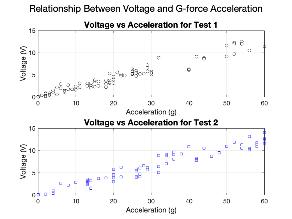
Plot Notes
This plot shows two separate plots within the same figure window with professional formatting. Notice that each subplot requires its own title, labels, and other formatting.
There is no legend required because there is only one data set on each set of axes and the titles differentiate the data sets.